*Fixing the video on Invader and Invaders, two 16mm black and white comedy horror films I shot back in college, on the Photos page.
*Adding over fifty interviews to the Links page.
*Adding easier contact info.
*Adding new items to the Store page.
*Adding new cover art and material on the Freebies & Ebooks page, and on the For Writers page, kicking off the Great Ebook Experiment.
The new covers are something I've wanted to do for a while. I've had over 10,000 ebooks sales on Kindle, but I've never been happy with the cheap cover art I did myself.
I complained about this a few months ago, and the good folks at www.bellbridgebooks.com offered to make me a cover for Disturb. You can see the obvious difference.
My crummy cover:
 The new cover:
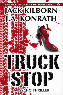
Seeing a 25% uptick in sales once I stared using the new cover, I hired a friend of mine to redo my other covers. Here are some of his creations:


I've recently uploaded these covers to Kindle, but it takes Kindle several days to update. So if you'd like to see my original, cruddy covers for a comparison, just search for my books on Amazon.
Everyone has opinions about cover art, but few people are able to articulate why they like something, or why they think it works (or doesn't work.)
I approached the new covers with some specific goals in mind. Whether I reached them or not is open to debate, but here was my thought process.
1. Branding. Each of the new covers has a JK banner on the top, with a blurb in it. Even though the images and styles on the covers vary greatly, I wanted a unifying factor. The simple brand JK does this.
2. Genre. I want the reader to be able to tell in two seconds what sort of book this is based on the cover. With Truck Stop, it's a serial killer/cop thriller. Shot of Tequila is a men's action novel, so I wanted a throwback to the pulps with a Robert McGinnis-type of image. Origin is a monster-on-the-loose book, and The List is a technothriller. I believe each of these covers convey their genre.
3. Professional. My early covers looked self-published, like someone with no talent played around with Photoshop--which was exactly what I did. I wanted the new covers to look like books that big publisher release. Or, in the case of Tequila, released 40 years ago.
4. Reduceable. Amazon, and many other e-tailers, shrink the covers to thumbnail size when browsing. I wanted these to still be identifiable and readable when compressed.
5. Eye-catching. After the initial, two-second impression, I wanted enough detail to get people to look closer. The background of Origin is a bible page. The List has a gene sequence, and a family tree of related events. Tequila has some blurbs, an aged appearance, and a fake cover price. With Truck Stop, besides the blood and the bloody tire marks, the heel on the shoe is broken. Hopefully this makes the reader wonder who owns the shoe, and why it is broken, which is answered in the story.
What are some other things you look for in covers? What makes a cover good or bad? And do we really judge books by their covers?
I'd love to hear your thoughts...